The Email dashboard is part of the Semrush Traffic & Market Toolkit, designed to reveal how competitors generate website traffic from email marketing campaigns.
Use this dashboard to analyze email marketing effectiveness across competitors, helping you discover untapped email marketing opportunities for your own campaigns.
Getting started with the Email dashboard
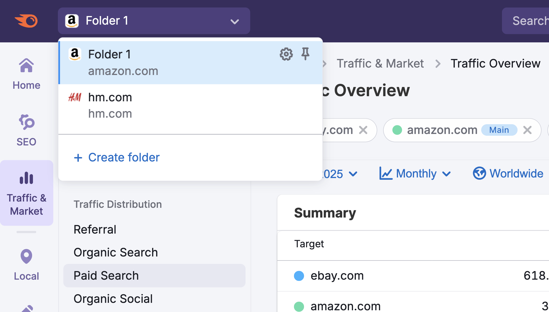
The Get Started menu is your entry point into the Semrush Traffic & Market Toolkit. It’s designed to help you quickly enter domains and move into your analysis of their traffic and marketing performance.

You’ll use this page to kick off your analysis—it’s your launchpad into the entire Traffic & Market experience.
If you haven’t created any projects yet, you’ll see a search panel where you can:
- Type in a domain — Start by entering the main domain you’d like to analyze
- Add additional competitors — Use the “+ Add more competitors” link to compare multiple sites at once
- Click the “Analyze” button — This will pull up dashboards with data and charts, starting with the Traffic Analytics dashboard
If you’ve already entered domains into the toolkit, you’ll see them saved as “Folders” and you can access them anytime.
In this case, you’ll see your saved folders listed on the Get Started screen. Click any one of them to jump straight into your dashboards and pick up right where you left off.

Use the “Create Folder” button to start a new project whenever you're analyzing a new domain or market.
Note: At any time inside any dashboard, you can select the Competitor list drop-down in the upper left to edit your current list or create a different one without losing your place.
How to use the Email dashboard
The Email dashboard is interactive and customizable. Use the filters at the top of the page to tailor your analysis and explore traffic flows in detail. Start by selecting your date range, location, and device type preferences.

At the top of the dashboard, you'll find the Traffic Trend graph showing your competitor's overall emaill traffic performance over time.
The graph displays the number of visitors (y-axis) over your selected period (x-axis), giving you a visual representation of how their email traffic has performed.

How to use this section:
- Hover on any point on the graph line to see the exact visitor count for that date
- Note if traffic surges coincide with specific events, product launches, or content releases
- Compare seasonal trends against your own traffic to identify timing opportunities
- Identify days of the week when email traffic consistently peaks

Use this data to schedule your own content releases and outreach initiatives during high-activity periods to maximize visibility and reach. If competitors consistently receive less weekend traffic, this might present an opportunity for you to capture attention when competition is lower.
Below the main Traffic Trend graph, you'll find two separate graphs that break down your competitor's email traffic by device type:
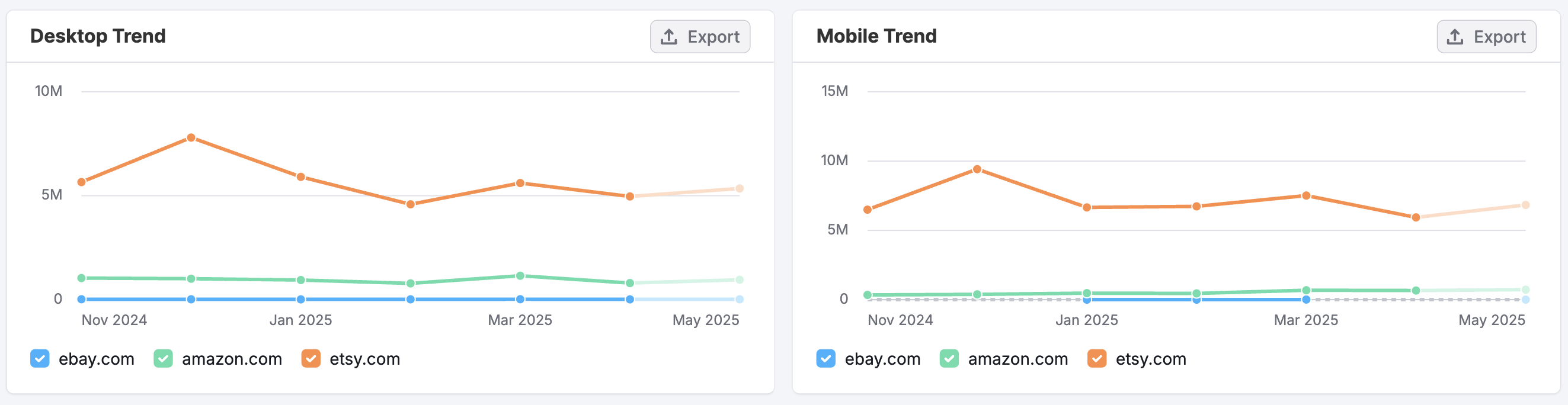
- This Desktop Trend graph displays email traffic coming specifically from desktop devices
- The Mobile Trend graph shows traffic coming directly from mobile devices
Just like the Traffic Trend graph, the y-axis displays the number of visitors over your selected time period (x-axis).
To use each section effectively, hover over any point on the graph lines to view exact visitor numbers. Compare the shapes of desktop and mobile traffic patterns to identify usage differences—for instance, mobile traffic may spike on weekends when users are away from their desks.
If a competitor shows strong mobile traffic, it may signal the need to improve your own mobile experience to stay competitive.

The Trending Pages section displays the specific pages on your competitor’s website that are receiving the most email traffic.
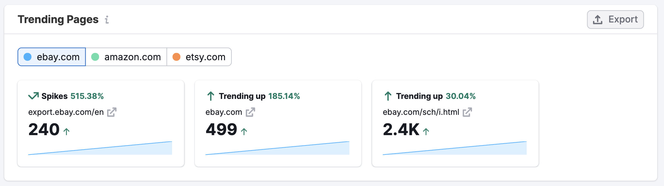
Use the domain filters at the top to toggle between competitors, each marked with a color-coded indicator for easy identification.
Trend indicators and percentages highlight key performance patterns:
- Spikes signal sudden surges—often tied to promotions or viral content
- Trending up reflects steady, sustained growth

Below, trending URLs show which pages are gaining traction.
- Click the up arrow next to any URL to view the page directly
- Traffic metrics display exact visitor counts, along with arrows indicating upward or downward trends
- Finally, trend lines offer a clear visual of traffic patterns over your selected time period
This data enables you to identify which content types perform well in your industry, discover emerging topics, and make informed decisions for your own content strategy based on proven success patterns.
How can I act on the insights found in the Email dashboard?
The Email dashboard reveals how competitors generate website traffic from email marketing campaigns—helping you uncover effective email strategies, landing page tactics, and traffic patterns to inform your own approach.
Here's how you can use the data to take meaningful action:
- Optimize campaign timing: Schedule your email sends during days and times when industry emails historically perform best.
- Enhance mobile experience: If the Desktop and Mobile Trend graphs show significant mobile traffic, ensure your email templates and landing pages are fully optimized for mobile devices.
- Create high-performing landing pages: Study Trending Pages to understand what types of offers and content convert well in email campaigns, then develop similar resources with your unique value proposition.
- Analyze seasonal patterns: Use the Traffic Trend data to identify when email engagement increases during specific seasons or events, and plan your email calendar accordingly.
- Identify content opportunities: By examining which pages competitors promote via email, you can discover content gaps in your own email strategy.
- Track performance changes: Monitor how email traffic patterns shift over time to stay ahead of emerging trends and adapt your strategy accordingly.
By regularly analyzing the Email dashboard, you can develop a data-driven approach to building valuable email marketing campaigns that drive qualified traffic to your site.
What related Traffic & Market dashboards should I use?
To get a complete picture alongside your Email insights, explore these related dashboards:
- Traffic Analytics – For a high-level view of total visits, engagement metrics, and traffic sources across all channels over time
- Top Pages – To analyze a site’s content structure and identify which pages attract the most visits
- Referral Traffic – To analyze which external sites drive traffic and how referral patterns vary across competitors
- Daily Trends – To track short-term changes in traffic, engagement, and specific channels on a daily level
- Market Overview – To benchmark domain performance against competitors and view overall market trends and share
These dashboards complement the Email dashboard by offering deeper insights into traffic patterns, content performance, audience behavior, and competitive positioning.